Technical Indicators Can Help or Distract You
Common Technical Indicators are: MACD, RSI, OBV, ADX, SMA, Stochastic and EMA
Technical indicators are derived from the open, high, low, close and volume data generated by the stock market. Manipulation of this data provides a number of indicators which stock traders place on their stock charts to provide them more information.
Bulls and bears are used to describe the up and down of the market. A bull tends to use its horns to lift oncoming threats out of
the way and raises them into the air which is the direction of a bull market. Bears
tend to come down on you from above hence they represent a bearish market or
one that is falling.
The above desk figurines depict the back and forth of the market as it unpredictably tends to move in a preferred direction. They make good gifts for traders, stock brokers or financial advisors.

In many cases, traders who have just purchased a computer with stock charting software dump all of the technical indicators they know of on the chart and when they all say buy, they buy.
When this is your plan, you might want to rethink it.
When I first started looking at charts with a computer, I had 3 tabs
of indicators. I think I was using 2 tabs for daily pricing and one for
weekly. It was confusing as I had no real plan and was unsure what to do
as many of the indicators were providing opposite signals.
Multiple technical indicators give you multiple signals so you end up just as confused as when there were no indicators on your chart.
A few well-chosen technical indicators will be a lot more valuable to you than lots of poorly chosen indicators.
The type of indicators you use will depend on the type of trading you want to do. For example, people who are trading new high breakouts would likely use different indicators than people who want to trade price cycles.
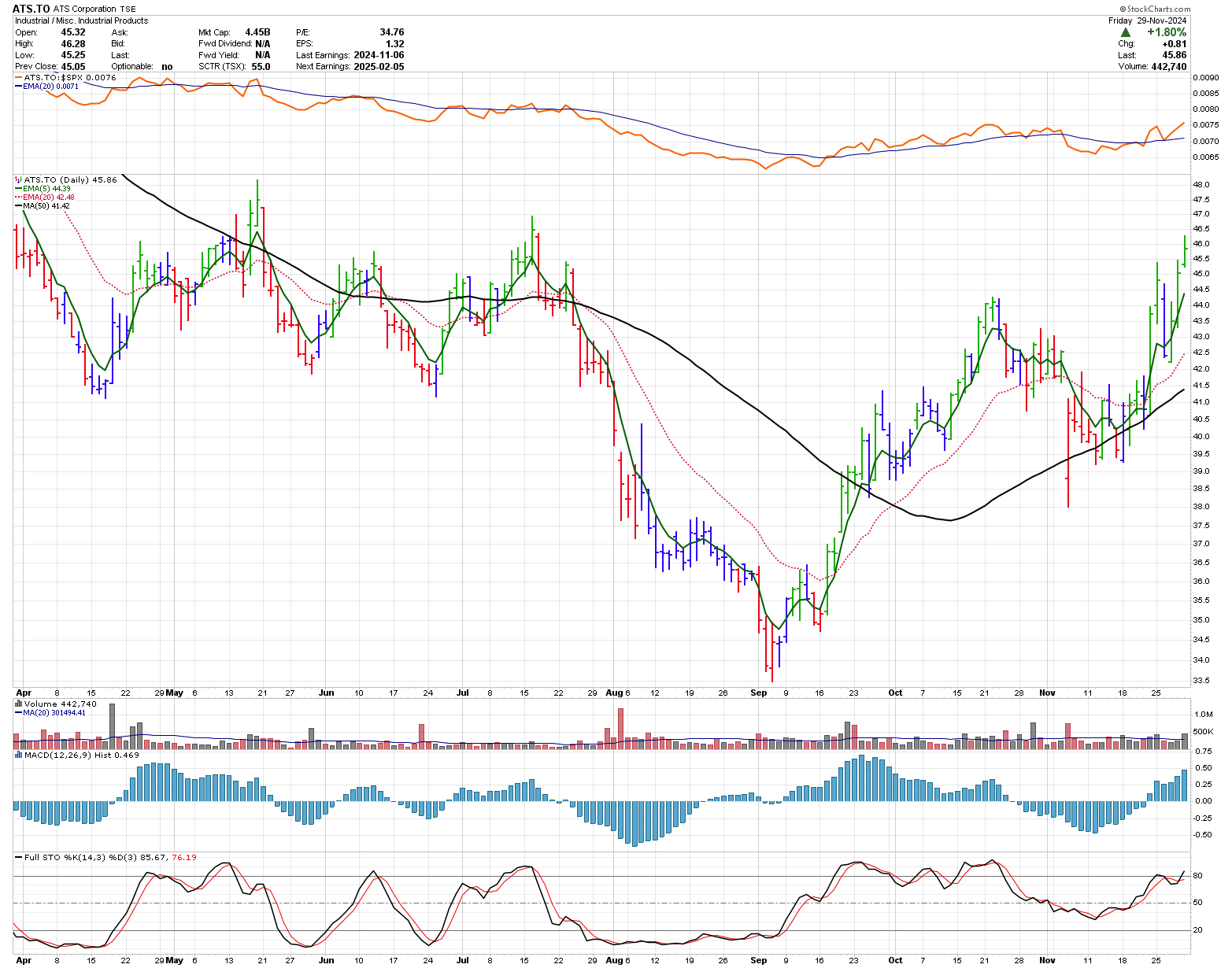
Let's take a eight month daily graph of ATS (ATS.TO) and add a few indicators. The chart now shows the basic price and volume data as well as a number of indicators.
At the top of the chart is a relative strength comparison of the stock price vs the $SPX Index.
On the chart, the bars are coloured in line with Elder's Impulse System and has a 5 and 12 exponential moving average (EMA) on it as well as a longer term 50 period simple moving average (SMA).
Underneath price is volume, are the MACD histogram and Stochastic indicator. What are all of these indicators telling you, if anything?
There are multiple signals and different traders learn to use these signals in different ways.
Chart courtesy of StockCharts.com

The thick orange line on top is comparing the strength of ATS.TO to the
Standards and Poors 500 Index (SPX). When the thick orange line is above
the thin blue line ATS.TO is outperforming the SPX index. Many traders only trade stocks that are showing more momentum than the index.
On top of the price movements are now two exponential moving averages and a simple moving average. In this example, the longest average is the 50 day simple moving average while the two shorter averages are the 20 and 5 day EMAs. A common technique is to buy when the short EMA crosses above the long EMA when the 50 day SMA is angling in the direction of the trade. Sometimes this works great while other times the number of false signals is quite large.
How many indicators are enough?
The black and red lines right under price are daily volume. For this graph, the volume in red occurs when the close is lower than the open while the black lines result when the close is higher than the open.
The Moving Average Convergence and Divergence (MACD) histogram is shown at the bottom of the graph and is represented by the blue vertical bars. The MACD measures the differences between two moving averages. Some traders use this indicator to measure a divergence between the stock price and the indicator. For instance, the stock hit a low in early September while the MACD histogram hit a low in early August. Thus, some traders might consider the stock is stronger in mid-July even though it is making a new low.
A reasonable buy using divergence would be to buy the higher high which occurred on September 17 yet this is going against the longer term SMA which is indicating that the stock is still bearish. The EMA's confirm the MACD on September 18. What to do?
At the very bottom is the Stochastic indicator which is pretty good for identifying cycle highs and lows. As an example, the low on June 24 was identified by this Stochastic indicator, Elder's bar turned green, there was a divergence with MACD pointing to strength and the price dropped down below the low of May 30 and then after 2 days rebounded. Seems like a good potential trade which worked in this example. However, this is not alway the case.
There are many books on indicators but before you start using them, you should understand them. Technical Analysis from A to Z by Steven B. Achelis is a pretty good book that describes and gives the formulas for most of the common indicators used today. I refer to it from time to time.
Most of the books in our technical analysis book review section contain some information on technical indicators.
Gifts for Stock Traders - Stock traders are a different breed. For the stock trader in your life or as a present to yourself consider getting a trading mug. This can be used throughout the day to sip on your favourite beverage and remind you that you are a trader.
Monte Carlo Simulator
for Traders
 Having troubles sticking with your trading system?
Do you move from system to system looking for the one system that will bring you riches?
Perhaps you already have it and tossed it aside when it went into a down period.
Using this Excel based program will show you what you can expect out of your trading system once you know the % wins and profit factor.
Stop wasting your time searching for the perfect system (which does not exist) and start trading.
$20.00


