A Stock Market Chart Tells All
Stock market charts present stock trading data in a graphical format
A stock market chart is a visual representation of a stock's trading history. As a stock trades throughout the day, each transaction consists of a single price with a specific volume e.g. 100 shares at $7.75. After a period of time, you can identify an open, high, low and close for the stock and the number of shares traded. You can also identify the number of transactions but this data is a bit harder to get.
Bulls and bears are used to describe the up and down of the market. A bull tends to use its horns to lift oncoming threats out of
the way and raises them into the air which is the direction of a bull market. Bears
tend to come down on you from above hence they represent a bearish market or
one that is falling.
The above desk figurines depict the back and forth of the market as it unpredictably tends to move in a preferred direction. They make good gifts for traders, stock brokers or financial advisors.
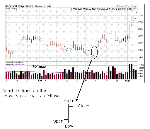
Shown below is a typical daily, stock chart. The stock is Microsoft Corporation. It has a ticker symbol of MSFT. Displayed is a stock market chart, which is displaying three months of stock price history, covering the time period from May 9 to Aug. 5, 2005. This data is presented in a typical Open/High/Low/Close (OHLC) and volume format. The blue line at the bottom, on top of the volume is the 50-day exponential moving average (EMA) of the volume.
Chart courtesy of StockCharts.com

So, you may ask, what does all this mean. When the stock market opens, the first recorded trade of a particular stock is considered to be the opening (open) price. As the stock trades during the day at some point there will be a price which is the lowest (low) and another price which will be the highest (high). The last trade of the day is considered to be the closing (close) price. This information as well as the volume or number of shares traded during the day is generally all of the data which is collected for each stock each day.
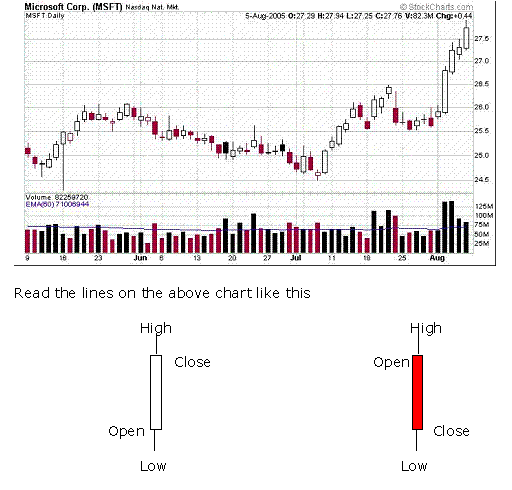
Another charting technique, invented by the Japanese, is the candlestick stock chart. Below is the same information as the above chart (Microsoft Corp., three months) represented as a candlestick stock chart.
In the candlestick chart below, the clear boxes represent days where
the close was above the open while the colored boxes represent days
where the close was below the open. The black body candles are when the
close was lower than the open yet the close was greater than the
previous days close.
Chart courtesy of StockCharts.com


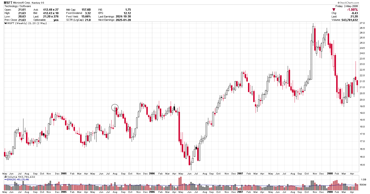
The above chart is still MSFT however, in a different time frame. This is a
four year weekly chart of Microsoft (MFST). Note that the right hand
side of the three month daily chart (above) tells us that MSFT is going
up while the four year chart tells us that during the week of Aug.
1, 2005 (circled)
MSFT
hit a new high. You may note that the price scales are different between the daily and weekly charts above. This is due to either splits or dividends.
What can you see on a stock market chart?
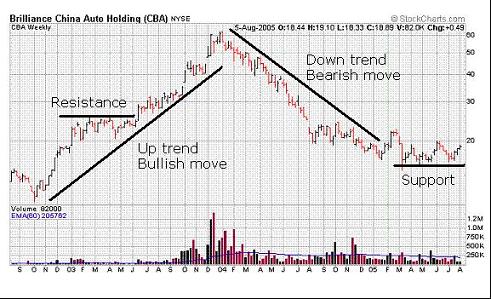
Stock traders use charts to identify trends and areas of support and resistance. To demonstrate this, a three year stock graph of Brilliance China Auto Holding (CBA) is shown below.
Four major chart patterns of interest are identified on this stock market chart.
Resistance: A price through which the stock has not been able to penetrate above. Penetrating above resistance is generally considered bullish.
Support: A price through which the stock has not been able to penetrate below. Penetrating below support is generally considered bearish.
Up trend or bullish move: The major trend of the stock is up.
Downtrend or bearish move: The major trend of the stock is down.
Chart courtesy of StockCharts.com

When you are beginning stock chart analysis, the patterns look complicated. However, after you view hundreds of charts you will begin to see areas which offer higher probability trading potential. You can view free stock charts on most of the major charting websites. Some of these have been highlighted in the trading resource section. After you become familiar with the standard open, high, low, close chart you may want to start exploring candlestick chart patterns.
I prefer the standard OHLC bars as I find them easier to read, all of the information is there and I don't have to recall which ones are up or down.
To learn more about a stock market chart take a look at the references in the technical analysis book review section. One book that contains a lot of information on stock charts is "Secrets for Profiting in Bull and Bear Markets" by Stan Weinstein.
You Can Change Your Trading Results
Another approach to learning more about stock market charts is to see how other traders are using them. If you are interested in improving your trading results, take the first step and start to get educated now. Below is an offer from a trader which should be able to educate you a bit more in the area of stock market graphs.
Short Swing Trading
David Graeme-Smith offers a very simple approach to trading in his book Short Swing Trading. I purchased this course many years ago and it has since been updated. There was one really interesting comment regarding the look of a chart which made the book very worth while, which I still use when I trade. Described is a trading strategy which gets you into and out of the market generally within two weeks. David provided a complete set of trading rules which will progress your trading more than the current buy and hope strategy used by so many traders and investors today. Just by understanding the rules of his simple trading plan you should begin to see an improvement in your trading results.
Gain more insight by understanding the stock market understanding the stock market.
Gifts for Stock Traders - Stock traders are a different breed. For the stock trader in your life or as a present to yourself consider getting a trading mug. This can be used throughout the day to sip on your favourite beverage and remind you that you are a trader.
Monte Carlo Simulator
for Traders
 Having troubles sticking with your trading system?
Do you move from system to system looking for the one system that will bring you riches?
Perhaps you already have it and tossed it aside when it went into a down period.
Using this Excel based program will show you what you can expect out of your trading system once you know the % wins and profit factor.
Stop wasting your time searching for the perfect system (which does not exist) and start trading.
$20.00


